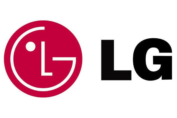
The Korean tech company, LG is rebranding its logo. The brand has tweaked its global brand identity, adding a bit of new color, expression and typeface to its “Life’s Good” brand slogan in a bid to make the brand friendlier to a new generation of customers.

The main difference one will notice is the introduction of a new, pinkish “LG Active Red” color which is now introduced alongside the brand’s signature LG Red color.
According to the brand, the new additional color, which will be used across all customer contact points, exudes a more energetic feel.
The Korean giant also planning to add more expression to its signature logo on the web by using expressive motions like winking, smiling and nodding.

LG says the brand’s new “dynamic and youthful” imagery is meant to appeal more to customers across geographies and generations, including Gen Z. It claims the identity “reiterates the core values of LG which include ‘Uncompromising Customer Experience,’ ‘Human-centered Innovation’ and ‘Warmth to Power a Smile.”


